VLands
Brand System & Experience Direction
A future-facing brand system for VLANDS, bringing clarity and cohesion to a platform built around virtual worlds, digital ownership, and connected experiences.
Overview
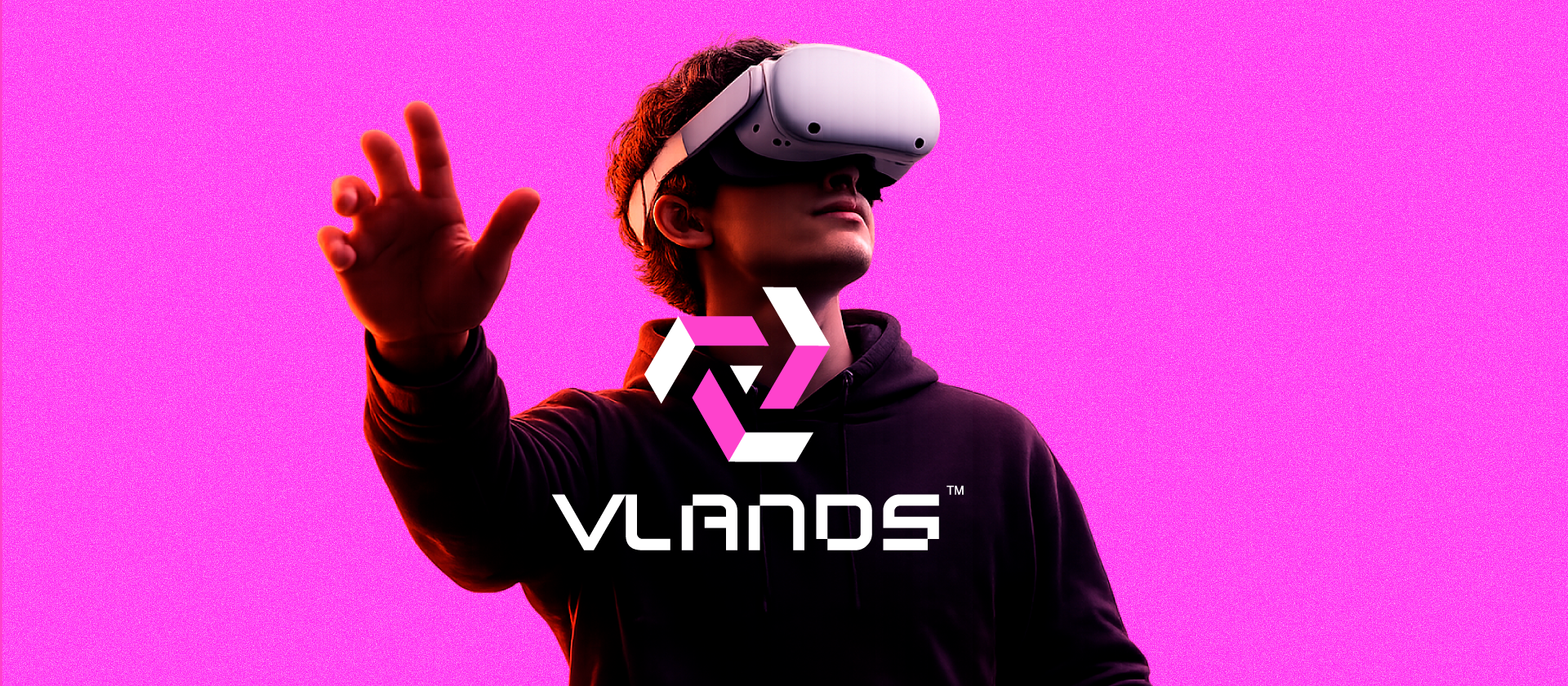
VLANDS is positioned as a next-generation metaverse platform—one that merges digital ownership, social presence, and persistent environments into a single, continuous system. However, the category is fragmented. Many platforms prioritize spectacle over structure, or technology over clarity. As a result, the experience of the metaverse often feels inconsistent—visually, conceptually, and functionally.
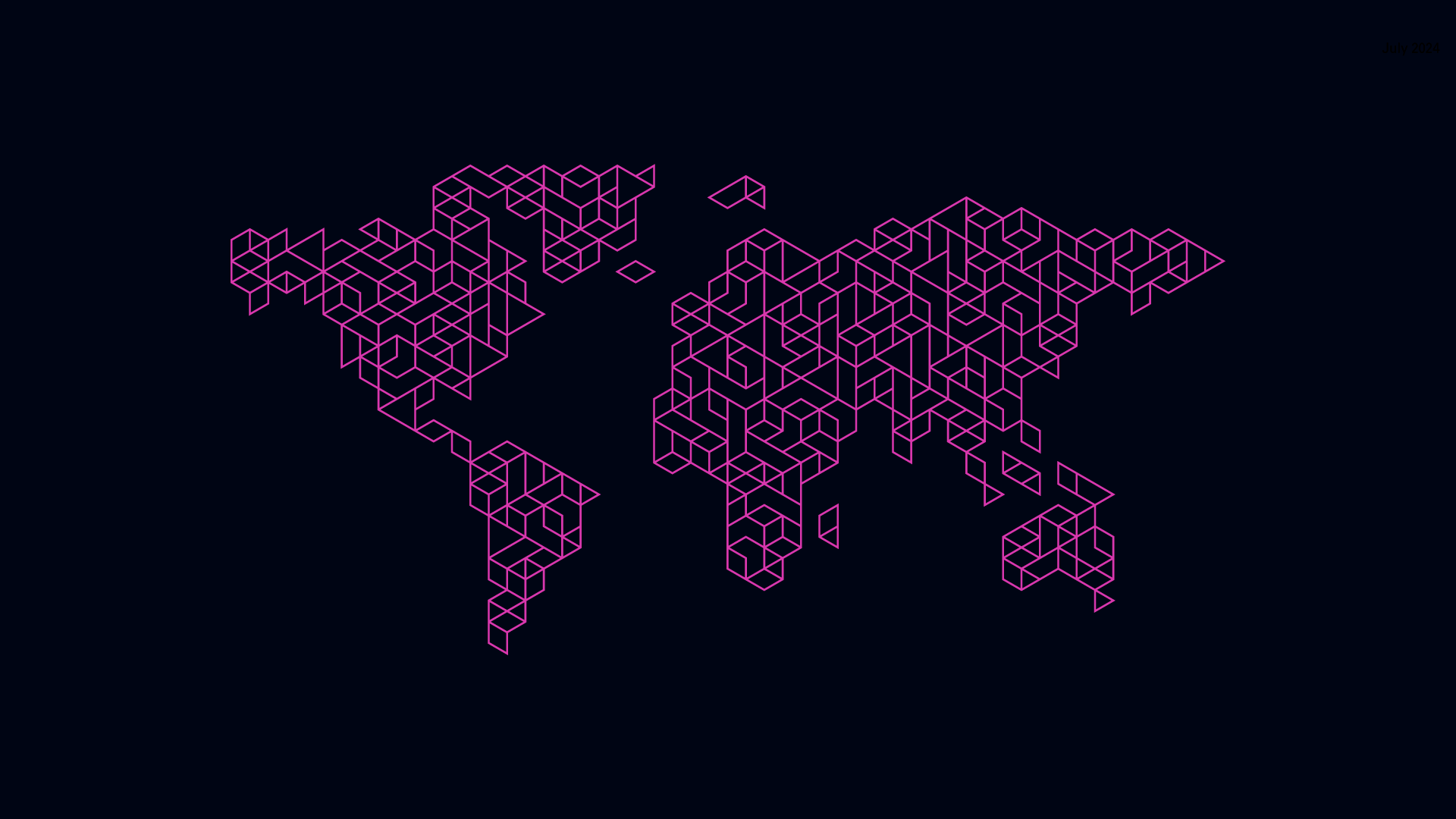
This project repositions VLANDS with a clear premise: The metaverse is not a world. It is infrastructure.
Rather than presenting VLANDS as a collection of virtual spaces, the brand is defined as a system for building, owning, and navigating digital land. The focus shifts from environments to the underlying logic that connects them—identity, movement, and interaction at scale.
Logomark
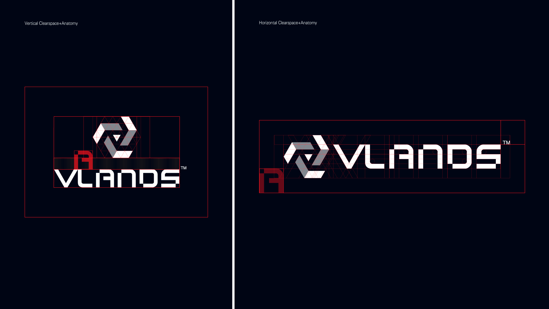
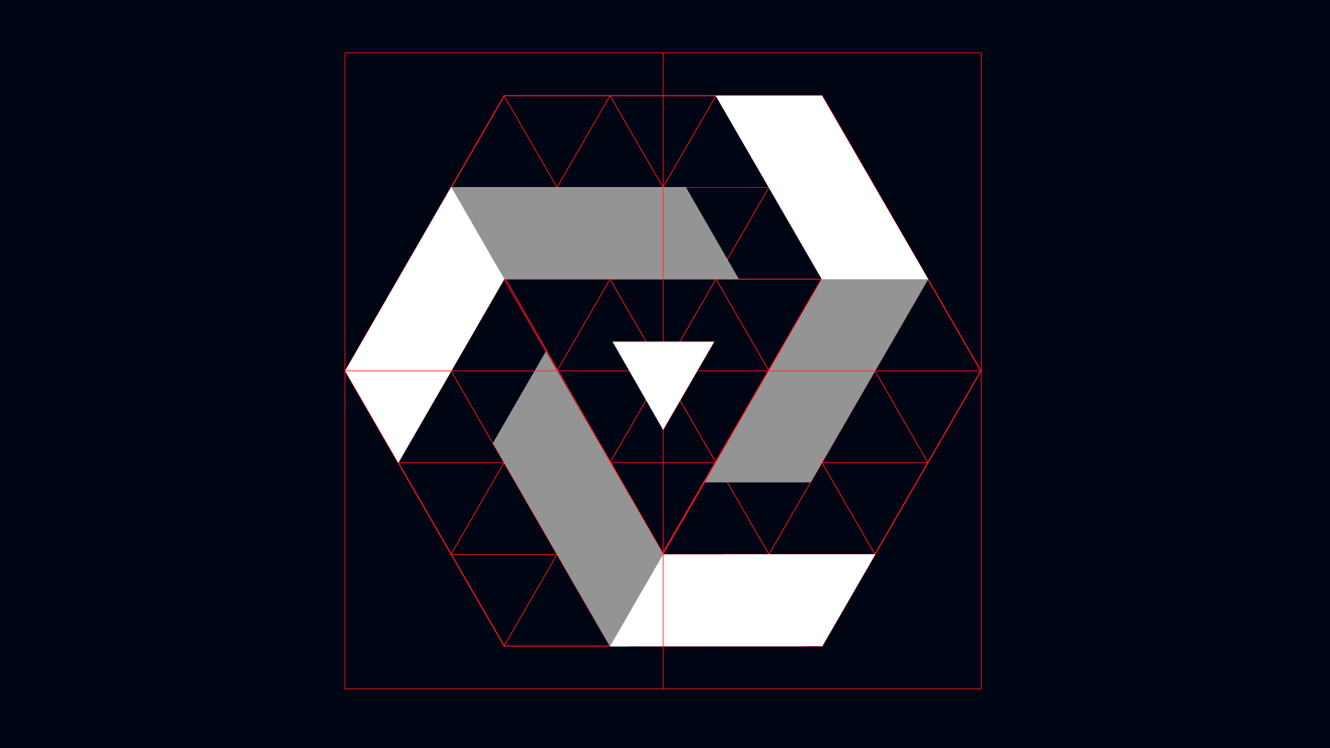
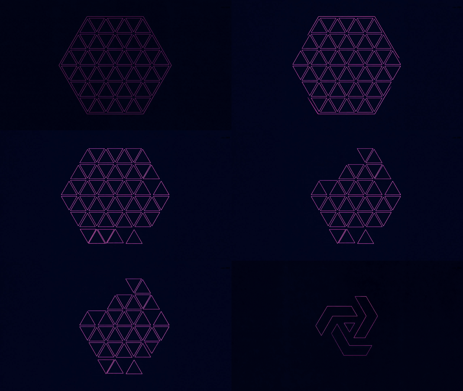
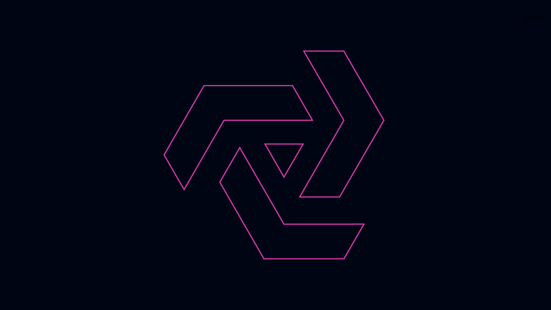
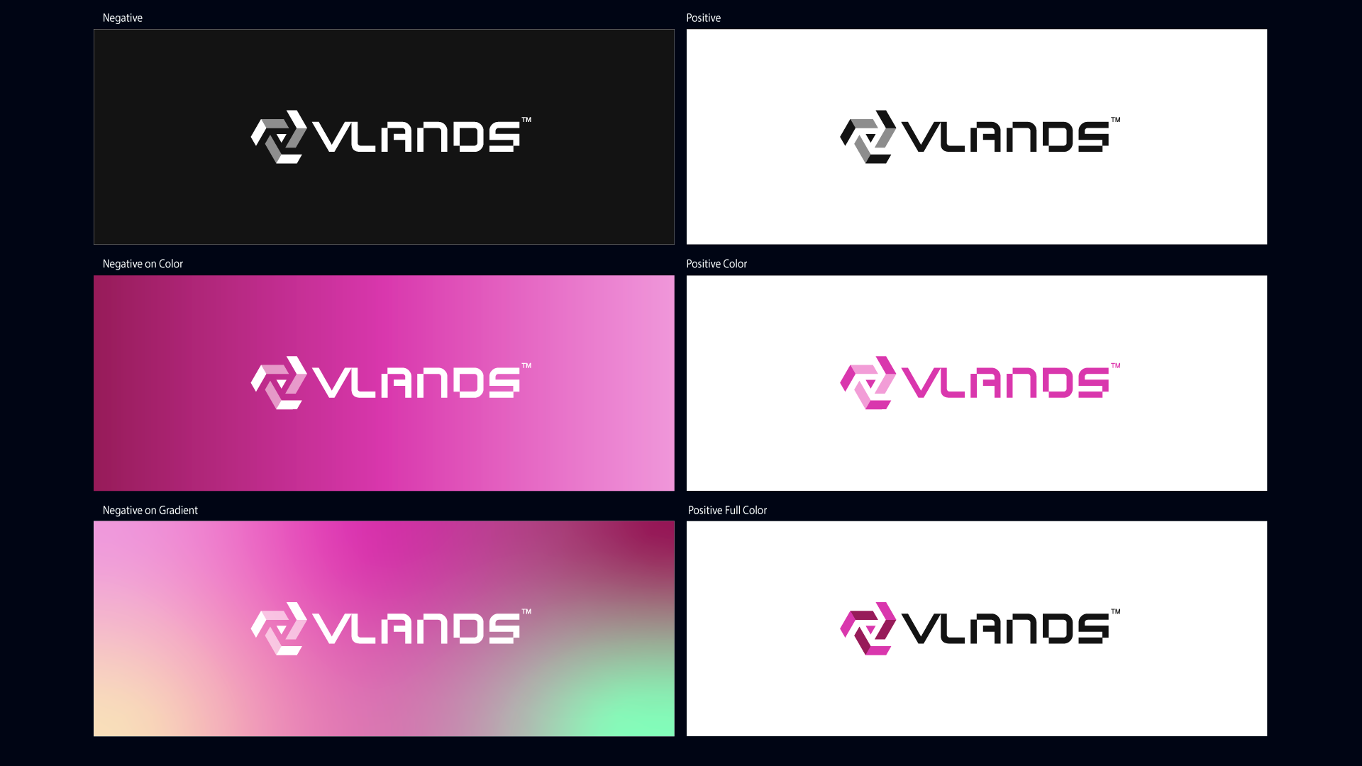
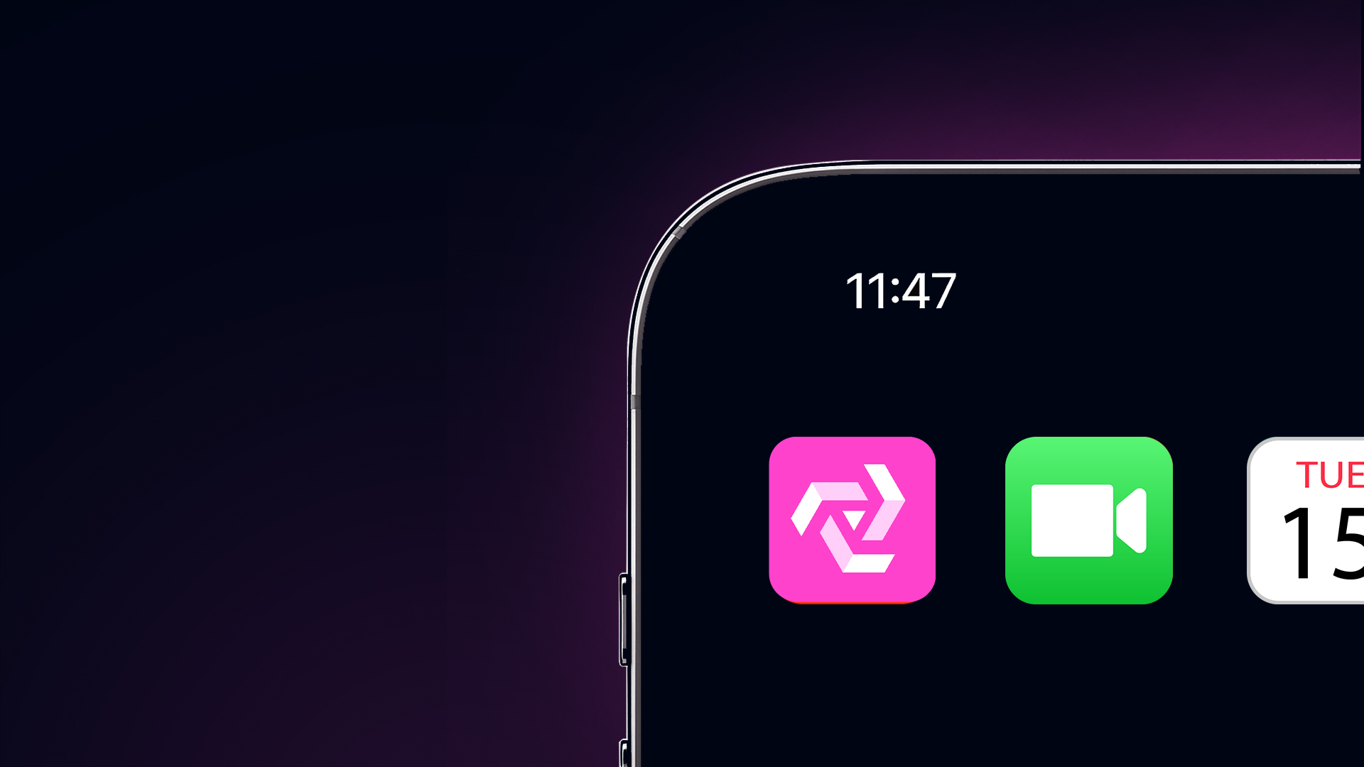
The VLANDS mark is constructed as a modular, interlocking system—an abstract “V” formed through spatial fragments that never fully close, but instead imply continuation. This open-loop geometry reflects the core premise of VLANDS: a living, expanding metaverse that is never fixed, never finished.
The mark balances precision with ambiguity. It reads as both object and system—something you can recognize instantly, but continue to interpret over time. This duality reflects VLANDS as both a place and a platform: structured, yet infinitely flexible.
Non-static
Conceptually, the segmented structure represents land parcels—individual “V-Lands”—each distinct yet part of a larger connected ecosystem. The gaps between forms are intentional: they create tension, and the sense that more exists beyond what is visible. This mirrors the metaverse itself—distributed, decentralized, and continuously unfolding.
Ultimately, the logo is not a static emblem—it’s a framework for expansion, echoing the idea that VLANDS is not just a world you enter, but one you actively shape.
Problem
The metaverse space is crowded, but still undefined.
A lot of platforms lean heavily on visuals or world-building, but the underlying experience often feels inconsistent. It’s not always clear how things connect, how you move through them, or what ownership actually means in practice.
VLANDS started with strong fundamentals, but no clear way to explain itself. It was a collection of ideas, not a single system.
The challenge was to bring clarity across visual identity and experience.
Approach
The work focuses on defining a cohesive brand and experience system.
This includes:
Visual Identity
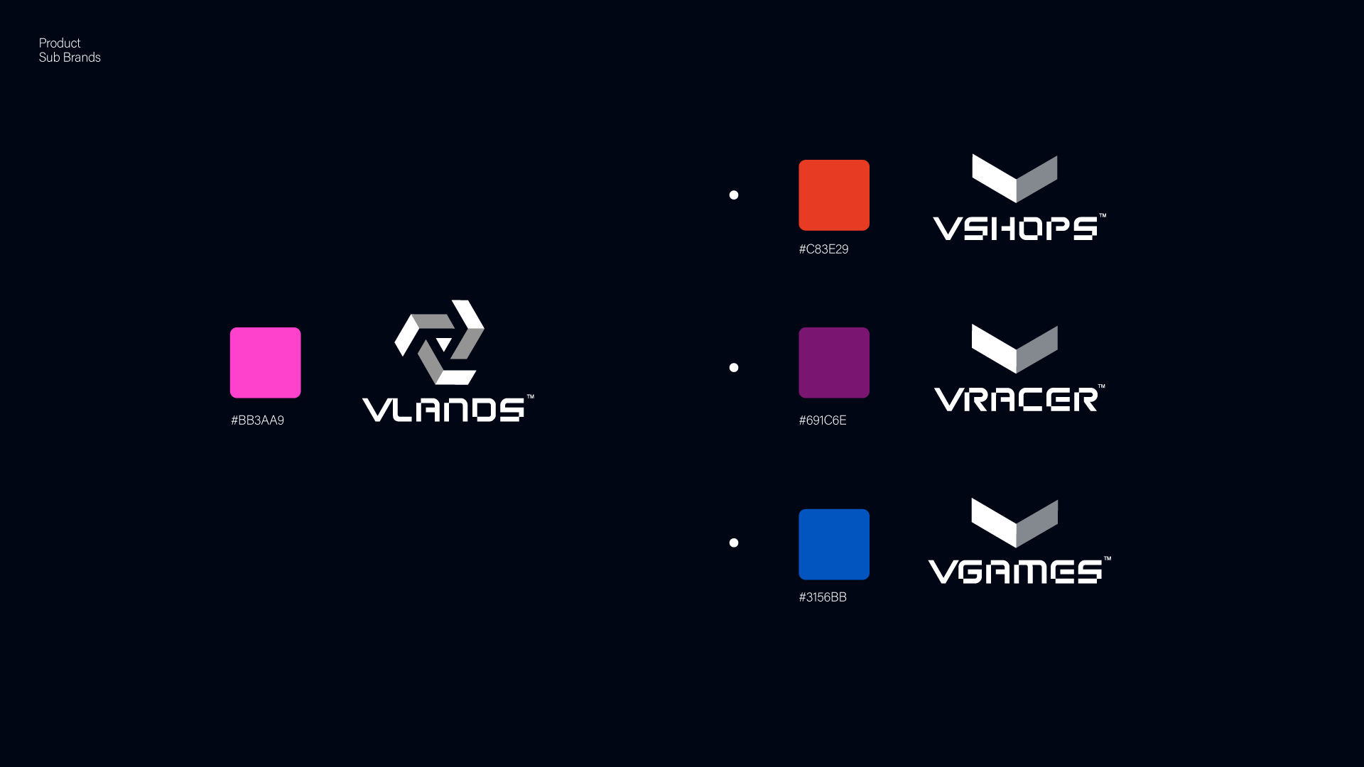
+A logomark and identity system designed to behave as a system, not a static asset
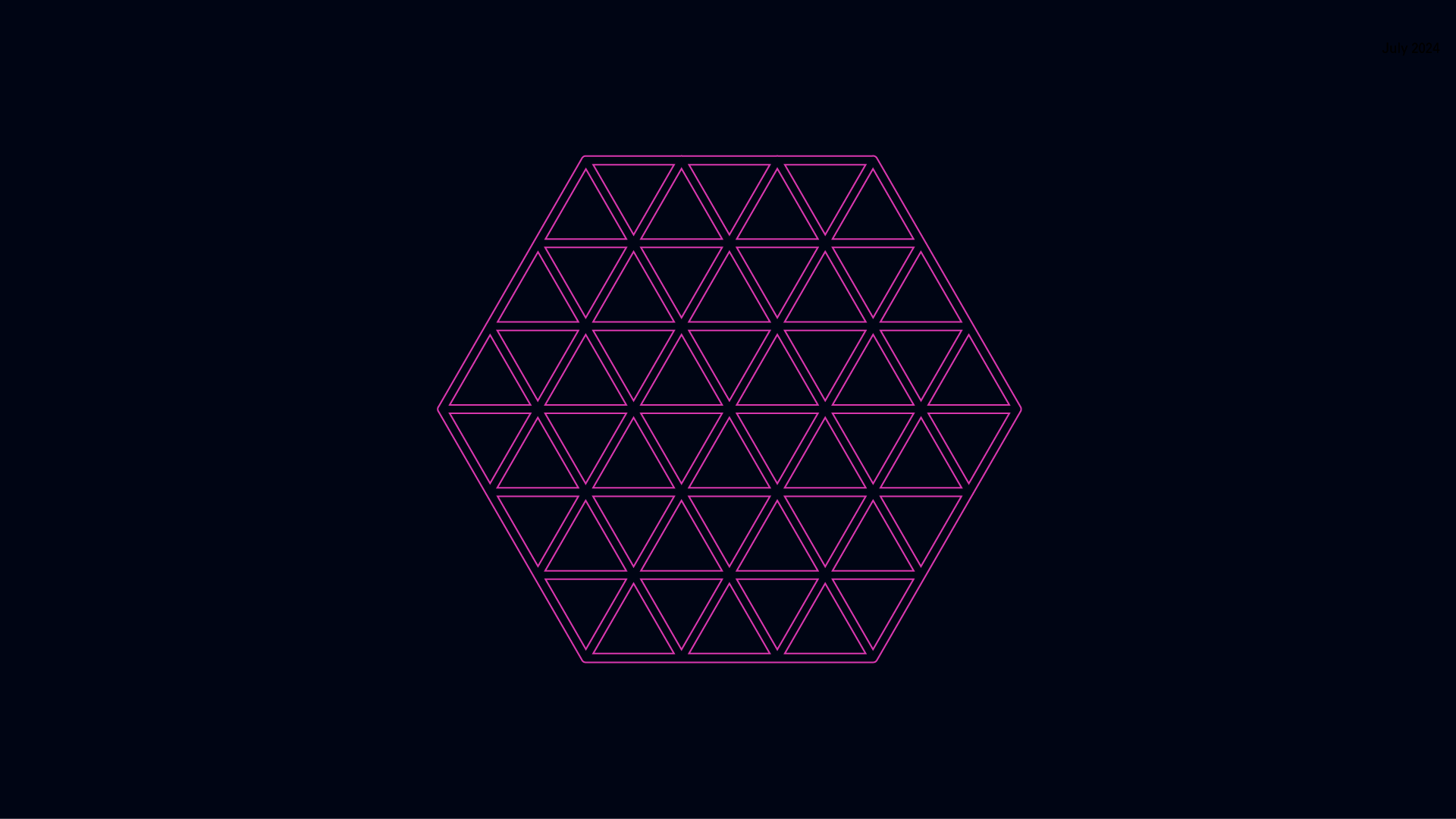
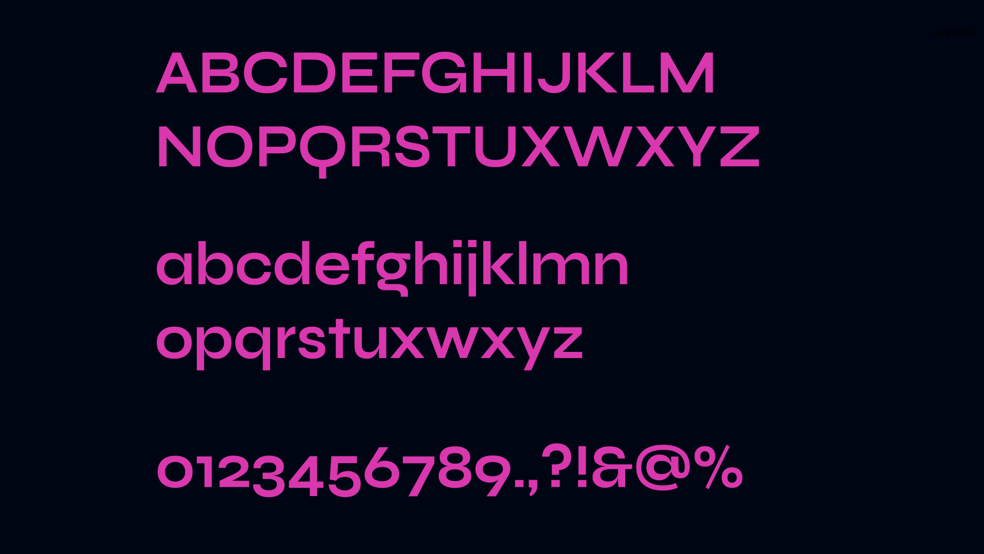
+A visual language grounded in structure, modularity, and spatial logic
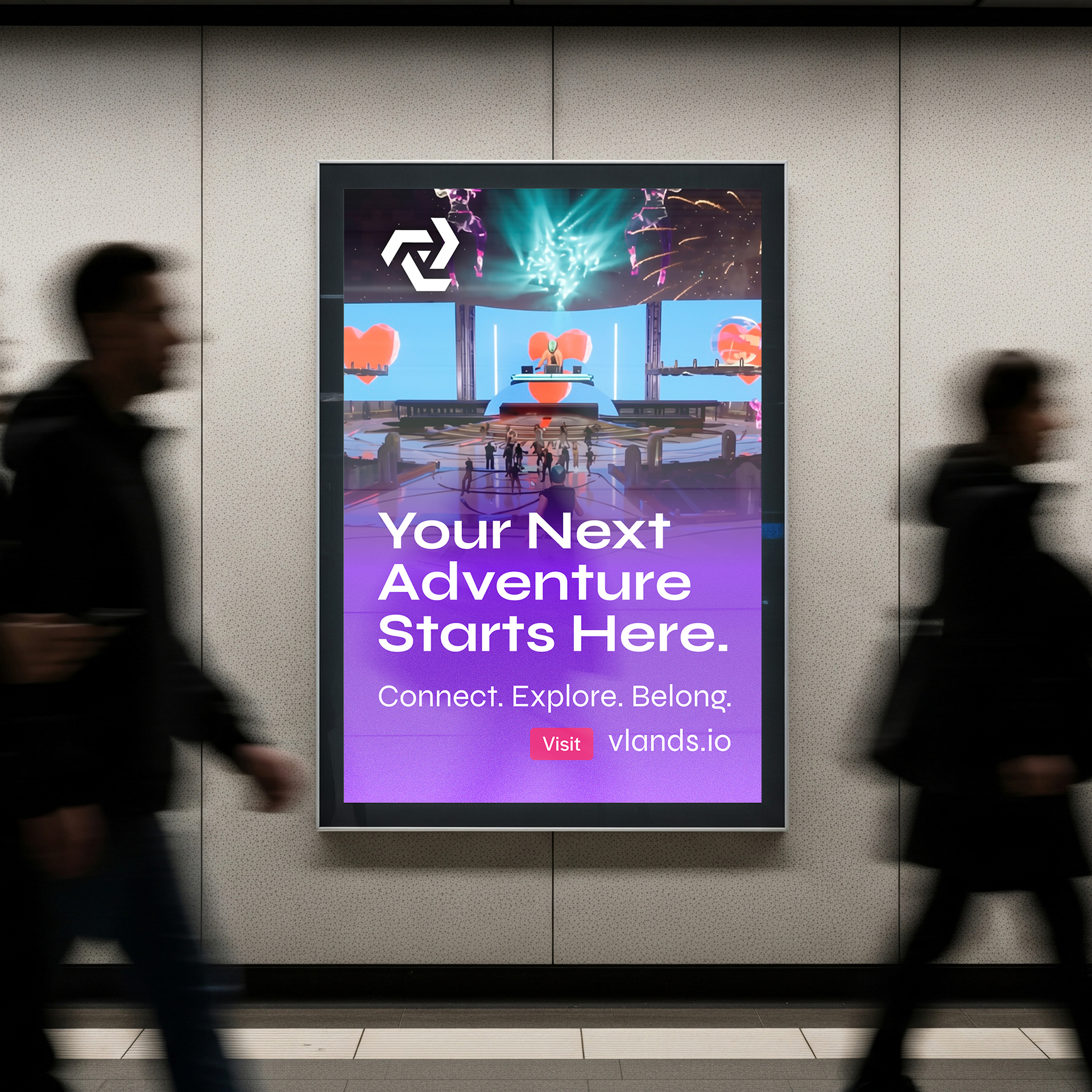
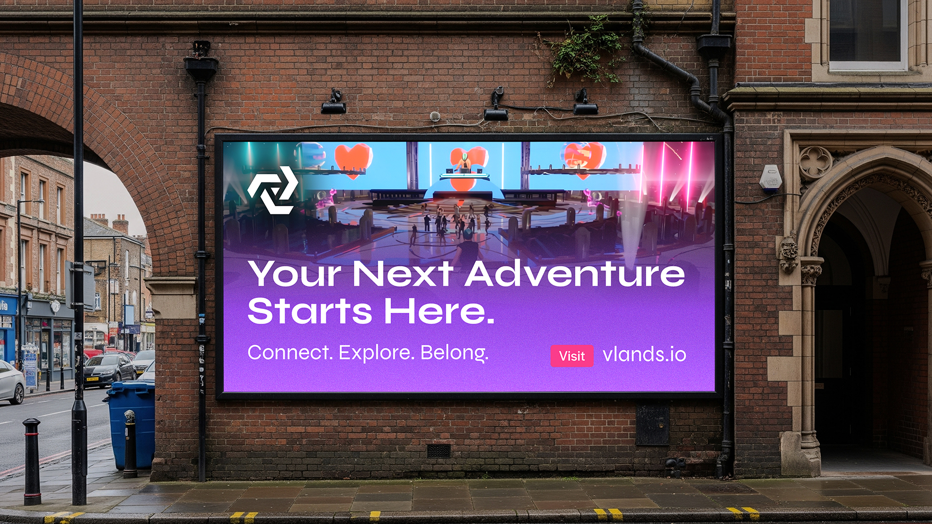
Across each touchpoint, the goal is consistency plus opportunity for growth—not in style alone, but in thinking. Every element should reinforce the same idea: that VLANDS is a platform you navigate, build within, have ownership, and return to.



Outcome
The result is a brand that positions VLANDS with greater precision.
Not as a virtual escape or a game. A place where not only do you have social interaction, but the opportunity to own land, build, and create.
But as a structured layer of digital space—where land, identity, and interaction are designed to scale.
Strategy
We set out to position VLANDS as a platform for digital land that feels consistent and navigable. Three things guided the work:
Clarity first: Make it easy to understand how things connect and where you are.
Build from parts: Everything—land, identity, environments—should feel modular and scalable.
Keep it consistent: The brand, product, and environments should all follow the same logic.
Overview
—
VLANDS
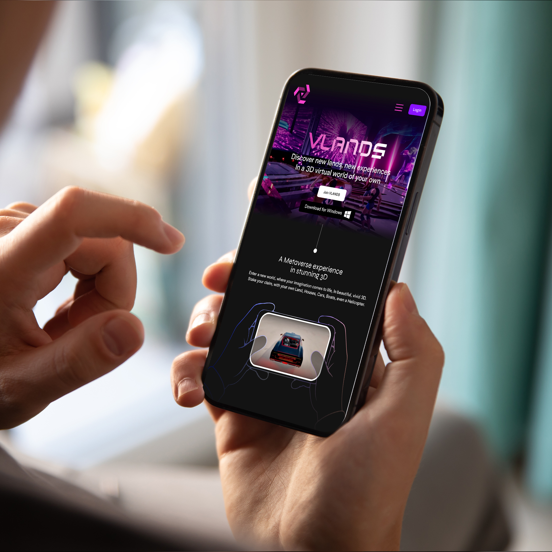
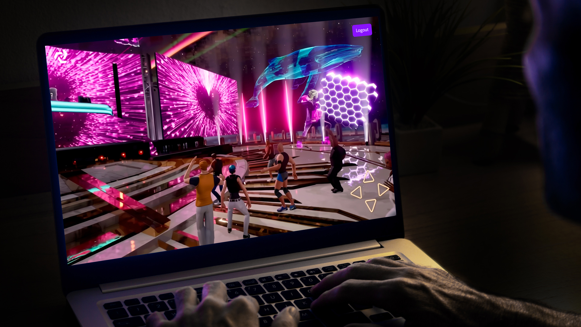
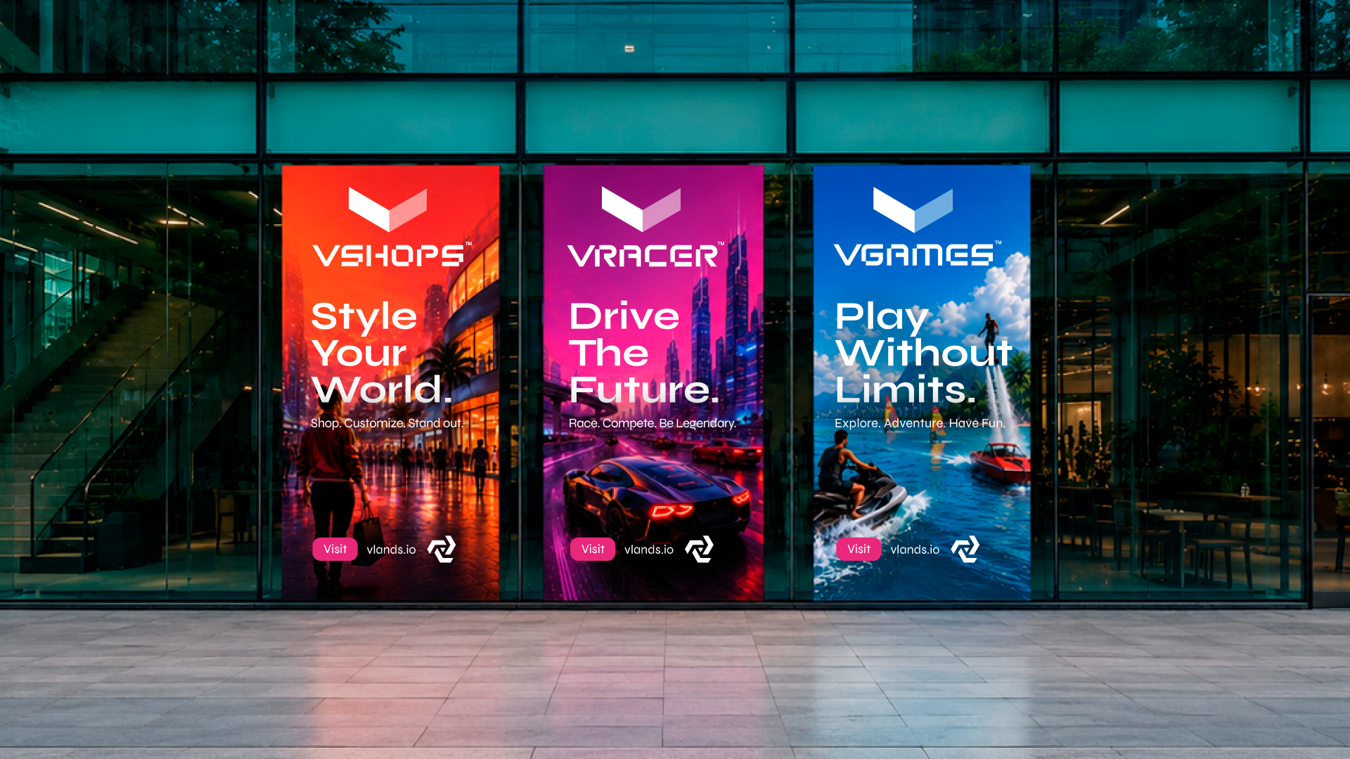
Visual identity for virtual real-estate and social gaming based metaverse.
Building a brand for an online retailer, focused on very select output with the goal to expand future product lines, provides unique design challenges. The answer: Develop a highly flexible brand with room to branch into seemingly unrelated industries.
Our team was tasked with identity research, brand guidelines, product photography, integrated advertising, and web design and development.
We have updated the brand as new products come into the line and revisit the user experience as the site has expanded and new needs arise. We've partnered with amazing brands like Asus and Audio Technica to provide progressive highly competitive products. We currently support the brand and it's line of smart watches, mobile phones, tablets, bluetooth speakers and headphones.
Art Direction: Matt Langhout
Design Manager: Andrew Brager
Digital Design & Animation: Matt Langhout, Jake Algren
Front-end Development: Tenzin Dhonyoe
+
—
Building a brand for an online retailer, focused on very select output with the goal to expand future product lines, provides unique design challenges. The answer: Develop a highly flexible brand with room to branch into seemingly unrelated industries.
Our team was tasked with identity research, brand guidelines, product photography, integrated advertising, and web design and development.
We have updated the brand as new products come into the line and revisit the user experience as the site has expanded and new needs arise. We've partnered with amazing brands like Asus and Audio Technica to provide progressive highly competitive products. We currently support the brand and it's line of smart watches, mobile phones, tablets, bluetooth speakers and headphones.
Art Direction: Matt Langhout
Design Manager: Andrew Brager
Digital Design & Animation: Matt Langhout, Jake Algren
Front-end Development: Tenzin Dhonyoe
Scope
—
Logo Kit
Identity System
Brand Strategy
Web Design
Building a brand for an online retailer, focused on very select output with the goal to expand future product lines, provides unique design challenges. The answer: Develop a highly flexible brand with room to branch into seemingly unrelated industries.
Our team was tasked with identity research, brand guidelines, product photography, integrated advertising, and web design and development.
We have updated the brand as new products come into the line and revisit the user experience as the site has expanded and new needs arise. We've partnered with amazing brands like Asus and Audio Technica to provide progressive highly competitive products. We currently support the brand and it's line of smart watches, mobile phones, tablets, bluetooth speakers and headphones.
Art Direction: Matt Langhout
Design Manager: Andrew Brager
Digital Design & Animation: Matt Langhout, Jake Algren
Front-end Development: Tenzin Dhonyoe
Credit
—
Design Direction: Matt Langhout
Design Manager: Andrew Brager
Digital Design: Yoriko Finger, Matt Langhout
3D Design: Yoriko Finger
Animation: Eric King, Matt Langhout
Building a brand for an online retailer, focused on very select output with the goal to expand future product lines, provides unique design challenges. The answer: Develop a highly flexible brand with room to branch into seemingly unrelated industries.
Our team was tasked with identity research, brand guidelines, product photography, integrated advertising, and web design and development.
We have updated the brand as new products come into the line and revisit the user experience as the site has expanded and new needs arise. We've partnered with amazing brands like Asus and Audio Technica to provide progressive highly competitive products. We currently support the brand and it's line of smart watches, mobile phones, tablets, bluetooth speakers and headphones.
Art Direction: Matt Langhout
Design Manager: Andrew Brager
Digital Design & Animation: Matt Langhout, Jake Algren
Front-end Development: Tenzin Dhonyoe

neurothink Ai PlatformIdentity System

Abey BlockchainIdentity Design
Winners League S5 IdentityIdentity & Brand Experience

WLS5 Season IntroBrand Experience

N2UIdentity & Brand Experience

VTVIdentity & Brand Experience
Mobilenet HighlightIdentity & Brand Experience
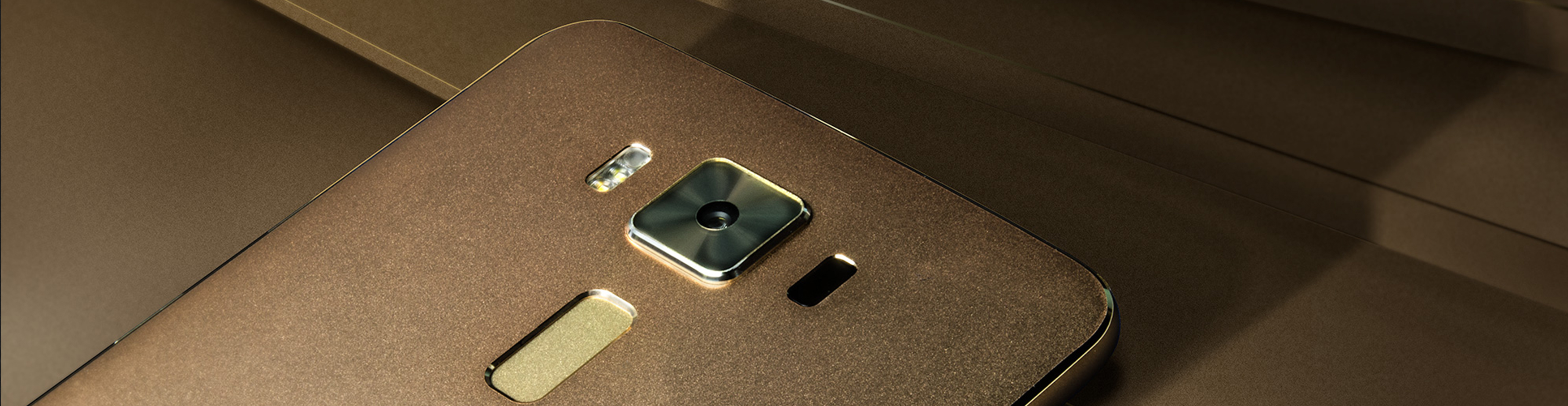
MobilenetIdentity & Brand Experience
WLS2Video

PackagingPackage Design

R&M DiamondsIdentity & Brand Experience
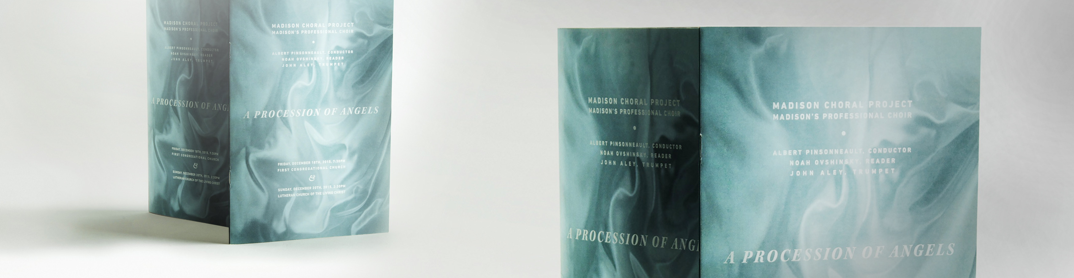
MCPPrint Design & Art Direction
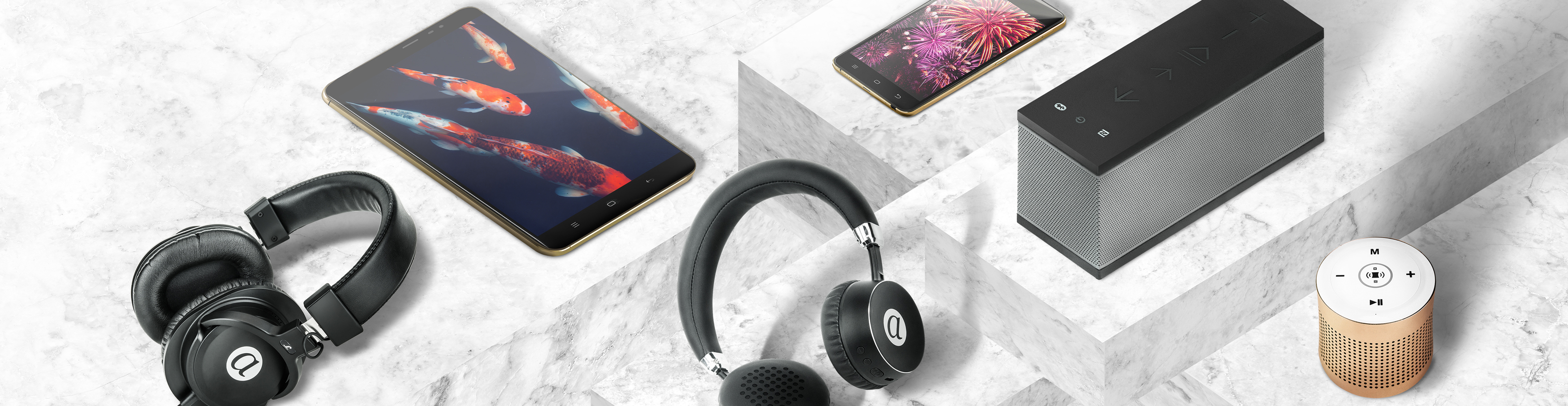
Mobile AudioArt Direction & Photography

AppmartBrand Identity

City HouseIdentity & Brand Experience
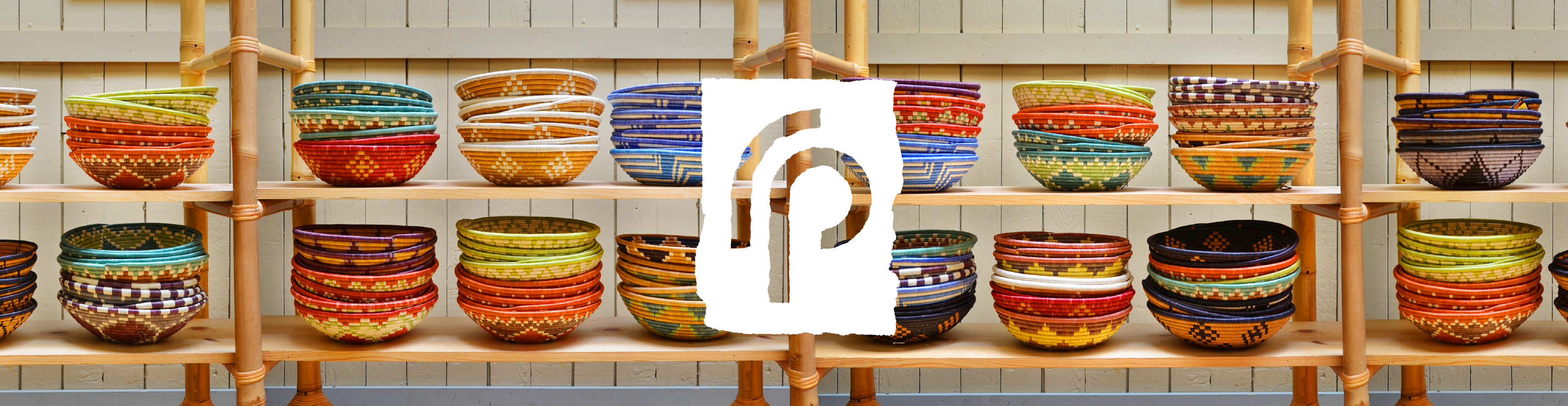
Rwanda PartnersBrand Experience